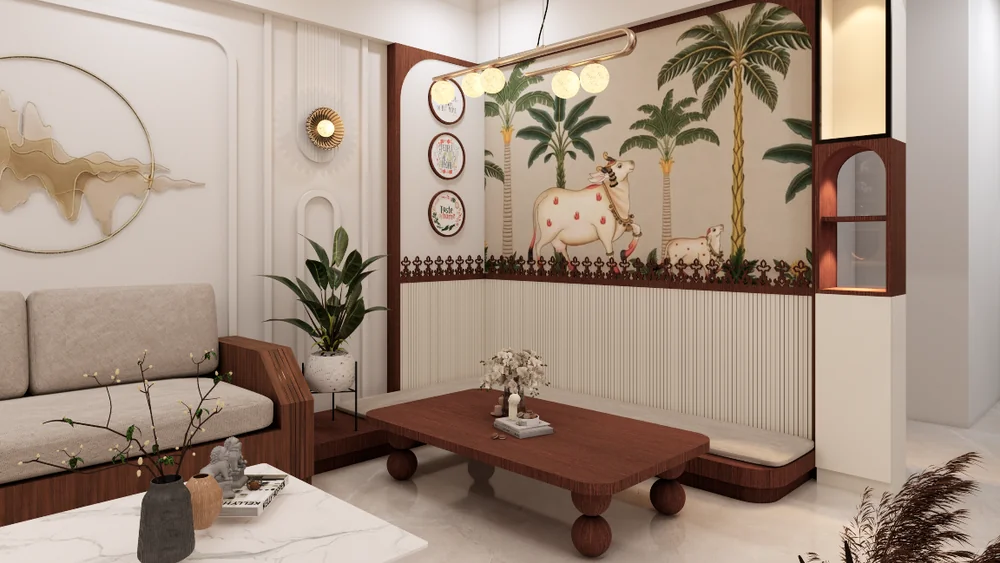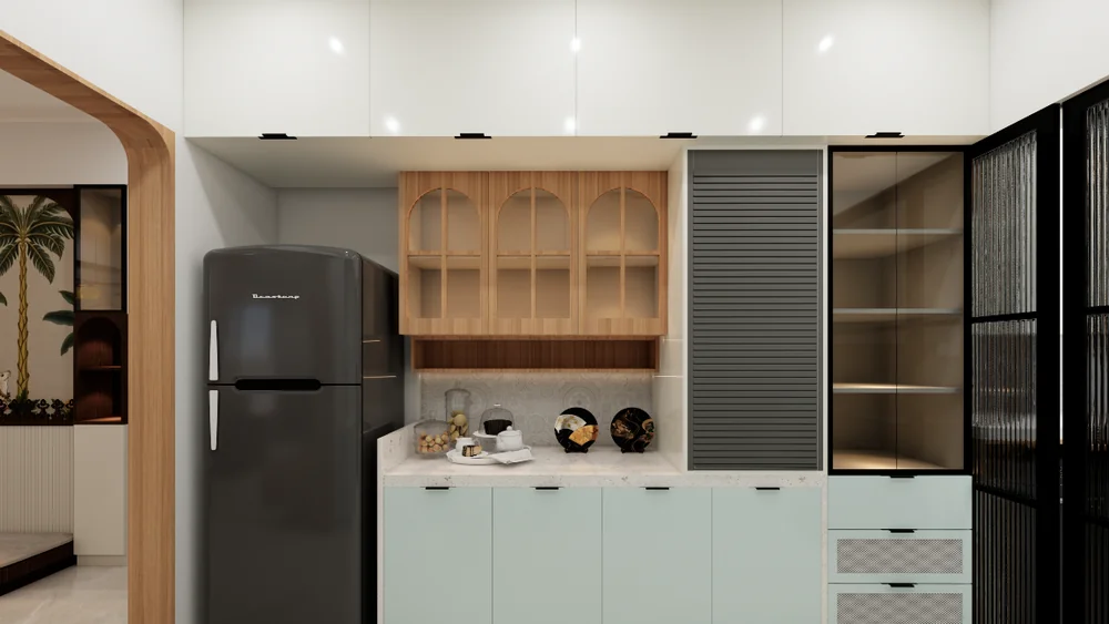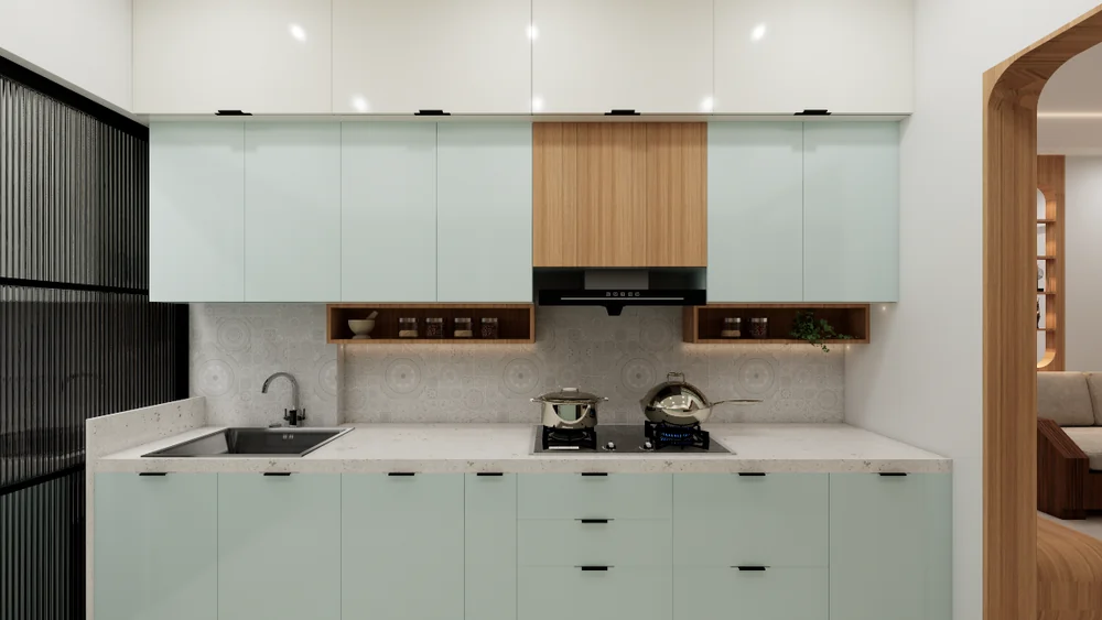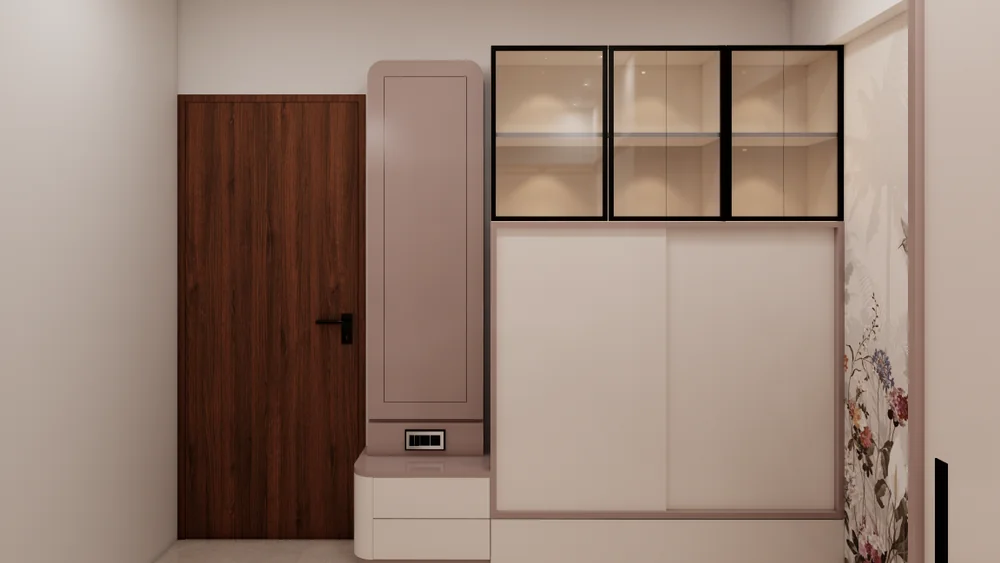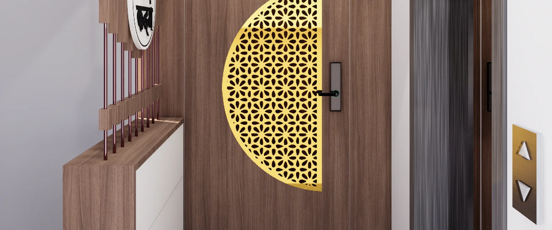
Compare tones, textures and finishes to build a practical palette that feels coherent throughout a home.
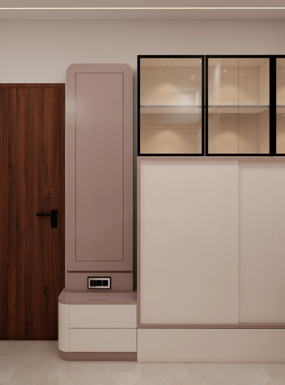
Begin with a simple base palette
Choose a small group of foundational colours for large surfaces such as walls, floors and major cabinetry. A restrained base makes it easier to introduce contrast through furniture, textiles and accessories without making every room compete for attention.
Consider natural and artificial light
The same finish can look different as daylight changes and under warm or cool artificial lighting. Review samples in the actual room, at different times of day and beside adjacent materials. Small sample boards are more useful than relying only on a screen or catalogue image.
Balance texture with colour
A neutral palette does not need to feel flat. Timber grain, woven fabrics, matte surfaces, stone-like textures and subtle metal accents can create depth while keeping the overall colour story calm. Use contrast intentionally and repeat selected finishes to create continuity.
Think about maintenance and use
A finish should suit the way a space is used. Consider cleaning, moisture, wear, touch points and how visible marks may be. A beautiful surface that is difficult to maintain may not be the right choice for a busy household or a high-use area.
Create continuity between rooms
Open sightlines make finish coordination especially important. Repeating a floor tone, wood finish or accent colour can connect adjoining rooms. Variation is welcome, but it should feel deliberate rather than accidental.
Make a finish schedule
Record the selected materials, colours, locations and any relevant product references in one place. A clear schedule helps keep decisions consistent as the project moves from concept toward execution.
Planning a Home Interior?
Explore Decorum Interior services for residential spaces, kitchens, bedrooms, living areas and thoughtful storage.
Explore Services